

-
Gothic Moon Phase Wall Art in Black and Gold
Regular price From $19.00 USDRegular price -
Moody Still Life Wall Art, Autumn Harvest Table Print
Regular price From $19.00 USDRegular price -
Vintage Black Cat Art Print, Full Moon Wall Art
Regular price From $19.00 USDRegular price -
Marathon Finish Line Wall Art, 26.2 Runner Gift
Regular price From $19.00 USDRegular price -
1776 American Flag Wall Art - We the People
Regular price From $19.00 USDRegular price -
Vintage American Flag Wall Art
Regular price From $19.00 USDRegular price -
Retro Waiter Bar Art, Framed Server Wall Decor
Regular price From $19.00 USDRegular price -
Retro Cocktail Table Art, Framed Bar Cart Decor
Regular price From $19.00 USDRegular price -
Retro Cheers Cocktail Toast Wall Art, Framed Bar Decor
Regular price From $19.00 USDRegular price -
Romantic Couples Wall Art - Framed Line Art Print
Regular price From $19.00 USDRegular price -
Dark Academia Wall Art - Black Cat Reading on a Rainy Day, Framed Print
Regular price From $19.00 USDRegular price -
Coffee Wall Art - Black Cat and Croissant Framed Print for the Kitchen
Regular price From $19.00 USDRegular price$0.00 USDSale price From $19.00 USD -
Santa Martini Wall Art, Vintage Christmas Bar Decor Print
Regular price From $19.00 USDRegular price -
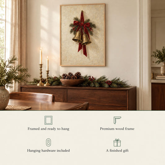
Christmas Bells Wall Art, Vintage Brass Bells Christmas Print
Regular price From $19.00 USDRegular price -
Vintage Propeller Airplane Sepia 3-Panel Glass Wall Art Set
Partner studio
Regular price From $439.90 USDRegular price -
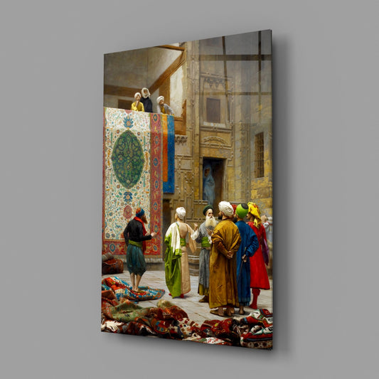
Carpet Merchants in a Bazaar Courtyard Glass Wall Art
Partner studio
Regular price From $159.90 USDRegular price -
Blue Bicycle Against a Weathered Red Wall Brushed Aluminum Wall Art
Partner studio
Regular price From $99.90 USDRegular price -
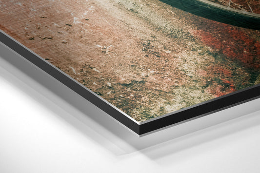
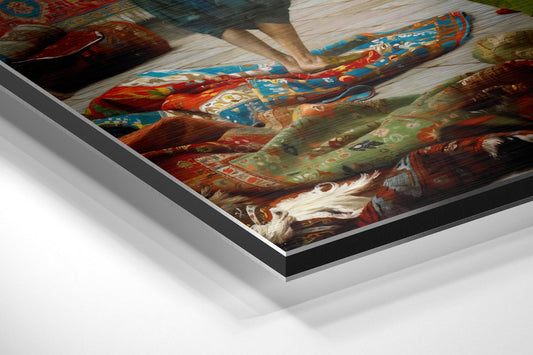
Carpet Seller in an Old Bazaar Courtyard Brushed Aluminum Wall Art
Partner studio
Regular price From $99.90 USDRegular price -
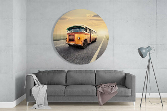
Vintage Yellow Bus on an Open Road Round Glass Wall Art
Partner studio
Regular price From $159.90 USDRegular price -
Vintage Ferris Wheel on Mint Sky Brushed Aluminum Wall Art
Partner studio
Regular price From $79.90 USDRegular price -
Vintage Bus on an Open Road Brushed Aluminum Wall Art
Partner studio
Regular price From $79.90 USDRegular price









- Free shipping available
- 30-Day Money-Back Guarantee
- Lifetime Quality Guarantee
- Made to order in the USA
- Certificate of Authenticity included
Free shipping, both guarantees, made to order and the Certificate of Authenticity apply to pieces designed by Sparkycare. Partner-studio pieces say so on their own page and follow their studio's shipping and returns.
Vintage wall art is doing something a modern print cannot: it puts a room in a time that is not now. The palette gives it away first, those slightly dulled oranges, mustards and teals that no contemporary designer would choose from a swatch book, and then the drawing style confirms it. The effect is warmth, and warmth is the thing most rooms are short of.
Why Retro Reads Warm
Mid-century and retro palettes were built around printing limitations rather than around taste. Fewer inks, flatter color, heavier outlines. That constraint is exactly why the results feel hand-drawn next to a modern gradient, and why a retro piece can carry a whole wall on its own where a clean modern print needs company.
The second reason is subject matter. Retro illustration is nearly always about a small scene rather than a concept: someone pouring a drink, a cat asleep next to a cup of coffee, two people in a moment. Scenes invite people in. Concepts do not.
What Is On This Shelf Today
The vintage work here currently runs to five clusters. Retro bar and cocktail-hour pieces, all warm color and mid-century line, designed for kitchens, bar carts and dining walls. And warm domestic scenes, the cat with the morning coffee, the reading corner, the couple, which suit living rooms, bedrooms and reading nooks. And vintage aviation, a sepia propeller airplane across three glass panels, for a study, office or hallway. And old-world street scenes, a bicycle against a weathered wall and carpet sellers in a bazaar courtyard, on glass and brushed aluminum, for a hallway or a living room. And retro road and fairground scenes, a vintage bus on an open road and a Ferris wheel against a mint sky, on round glass and brushed aluminum, for a den, a kitchen or a hallway.
Vintage as a category runs much wider than those five, taking in travel and botanical illustration and old advertising style, and the shelf widens in that direction as designs ship. Those are named here as the territory this page serves, not as stock currently on it.
Where Retro Pieces Go
Bar and cocktail pieces belong in a kitchen, a dining room or beside a drinks cabinet, and they benefit from being hung slightly lower than instinct suggests, because they are looked at while standing rather than while seated. 11x14" and 16x20" suit a bar cart or a narrow kitchen wall.
Warm domestic scenes work in living rooms, bedrooms and reading corners. Above a sofa or a bed, use roughly two thirds of the furniture width, which usually lands at 18x24" or 24x36".
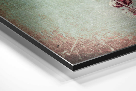
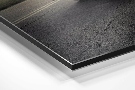
On our framed prints: natural wood is the natural partner for warm retro palettes and is the default choice. Dark wood deepens a piece in a room that already leans warm. Black sharpens high-contrast graphic work. White is the one to avoid on a warm palette, because it fights the very thing that makes the piece work. The glass and brushed aluminum pieces need no frame: glass is printed on the back of tempered glass with a smooth glossy front, aluminum is printed on a brushed aluminum panel with the metal grain showing through, and both come with an adjustable steel mount; screws and wall plugs are not included.
How Our Own Designs Are Made
Each of our own designs is produced after the order is placed, printed with fade-resistant, archival-quality inks, then framed in solid pine at 20 to 25mm deep with a 10 to 14mm face behind shatterproof plexiglass rather than glass. It arrives ready to hang with the hardware fitted and a Certificate of Authenticity, and each is backed by our 30-Day Money-Back Guarantee and our Lifetime Quality Guarantee. Production runs one to four days, around 90% of those orders arrive within five days of dispatch, free shipping is available, and sizes run 5x7" to 28x40". The glass and brushed aluminum pieces come from independent partner studios; each product page shows its sizes, how it ships and its return window.
Vintage Wall Art Questions
What makes a print read as vintage rather than just old-fashioned?
Palette and line weight. Retro work uses fewer, flatter colors and heavier outlines, because that is what period printing allowed. A modern print that simply depicts an old subject usually still reads as modern, because the color is too clean and the gradients are too smooth.
Does vintage art work in a modern room?
It works particularly well in one, because it is the element doing something different. A retro piece against plain modern walls and simple furniture reads as a deliberate choice. Put the same piece in a room that is already fully period and it disappears into the scheme.
Which frame color suits retro palettes?
Natural wood, in most cases. It picks up the warmth in the artwork instead of cutting against it. Dark wood works in a room that already leans warm, and black suits high-contrast graphic pieces. White frames tend to flatten a warm palette.
What size for a kitchen or bar wall?
11x14" or 16x20". Kitchen and bar walls are usually interrupted by cabinets, sockets and shelving, so a mid-size piece fits the gap that actually exists. Save 24x36" for a dining wall or above a sofa.
Do retro pieces work in a group?
Yes, and they are forgiving of mismatched subjects because the shared palette does the unifying. Keep the frame color identical across the group and let the sizes vary if you want the arrangement to look collected rather than bought at once.
Keep Exploring
For the graphic, pared-back end of the shop see minimalist wall art and line art prints. Retro pieces sit among our picks in best sellers, and they make good housewarming gifts. Everything is in all designs.