Bohemian Interior Design: How to Get the Look Without the Clutter
Francisco Barbero
Bohemian interior design, usually shortened to boho, is a relaxed, collected look built on natural materials, layered textiles, plants, and a warm earthy palette, with a free mix of patterns and vintage or global pieces. The aim is a space that feels lived-in and personal rather than matched. Done well, boho reads as warm and curated, not cluttered.
That last part trips most people up. The line between cozy and chaotic is real, and it comes down to a few habits rather than a long list of rules. Below is what the style actually is, the pieces that make it work, how to use boho wall art, how it plays out in a bedroom and a living room, and how to keep the whole thing feeling calm.
What Is Bohemian Interior Design, Exactly?
Boho is an eclectic, casual look that pulls from different cultures, eras, and creative influences instead of one tidy theme. It leans on layered textures, a warm color base, and plenty of natural touches, and it values personal expression over strict coordination. The roots go back nearly 200 years to 1830s Paris, where the word "bohemian" described artists and writers living an unconventional, nomadic life, a thread traced by Encyclopaedia Britannica through to the 1960s and the look we borrow from today. There are 2 broad versions. Classic boho is bold and colorful with lots of pattern. Modern boho keeps the same warmth but pulls the palette back to neutrals and earth tones, which is the version most people picture now. Both share one idea: the room should feel collected over time, not bought in a single afternoon.
The Key Elements of Bohemian Decor
Boho is less a checklist than a feeling, but 6 elements show up in almost every version of it. Natural materials come first: rattan, jute, wood, cane, and bamboo give the room its earthy backbone. Layered textiles add the softness, things like woven throws, a macrame hanging, floor cushions, and rugs stacked one over another. Plants bring life, and they earn their place; the Royal Horticultural Society notes that indoor greenery is linked to better mood and lower stress, not just a prettier shelf. A warm, earthy palette ties it together, terracotta, mustard, olive, and cream, often with a few jewel-tone pops. On top of that sits a relaxed mix of patterns and a handful of vintage or globally sourced pieces that give the space its story. You do not need all six at full volume. Two or three, layered with intention, already read as boho.

How to Use Boho Wall Art
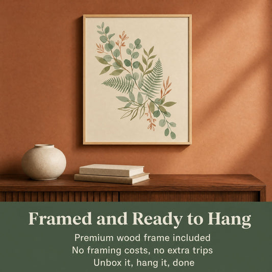
Wall art is where a boho room finds its focus, because all that texture down low needs something to anchor the eye up high. Boho wall art tends to lean warm and organic: earthy abstracts, botanical and line-art prints, soft landscapes, and globally inspired motifs in muted, sun-faded tones. The big question is usually 1 piece or a gallery. A single large print works over a bed or sofa and keeps a busy room calm, while a small gallery of 3 to 5 prints suits boho's collected spirit, as long as the pieces share a palette so the wall reads as one idea rather than five.
Frames matter more than people expect, and mixing finishes is part of the look rather than a mistake. That is a subject of its own, so we gave it one: our guide to boho wall art ideas covers frame mixing, size rhythm, and how to arrange a cluster so it reads as gathered rather than scattered.
The Boho Color Palette
Color is what separates boho from a plain neutral room, and it follows a loose 3-part logic. Start with a warm, calm base on the walls and big furniture, usually white, cream, oatmeal, or soft beige, so the busier pieces have room to breathe. Layer in earth tones next: terracotta, rust, ochre, olive, and warm browns carry most of the boho feeling. That middle layer is where the art usually sits, and our earth tone wall art collection is grouped on exactly those hues, so the pieces already agree with each other. Then add 1 or 2 accent colors as pops, often a jewel tone like deep teal, emerald, or burnt orange, kept to cushions, art, or a single textile. The trick designers repeat is to hold the whole room to a handful of hues that get along, rather than reaching for every color at once. A tight palette is exactly what lets you mix lots of patterns without the room turning loud.
Boho Bedroom Ideas That Stay Restful
The bedroom is where boho most often tips over, because it is the room people layer hardest. The fix is to pull the palette tighter here than anywhere else in the house. Sand, clay, and one muted green will carry a whole bedroom, and the pattern budget is better spent on 1 textile than spread across 4.
Start with the bed, since it takes up most of the room's visual weight. Cotton or linen bedding in cream or oatmeal, then one textured layer over the foot, a waffle blanket or a rust throw, is enough. A cane or rattan headboard is the single highest-leverage boho piece you can buy, because it brings natural material in at the scale the room actually notices. On the floor, a jute base with a smaller flatweave over it beats one busy rug. For greenery, one trailing plant hung at height does more for a bedroom than three sitting on the floor. Then leave a surface empty on purpose, usually the nightstand, with a lamp and nothing else. Restful rooms are mostly about what is not on them. Our bedroom wall art collection leans to the calm end of the palette if you want to start there.
Boho Living Room Ideas That Feel Gathered
A living room can carry more pattern than a bedroom because it is bigger and because nobody is trying to sleep in it. That extra room is what makes it the easiest place to get boho right, and the easiest place to overdo.
Anchor with one seat in a natural material, a rattan or cane frame with linen cushions, and let it be the thing the eye lands on. Layer the floor the same way as the bedroom but with more contrast: a jute base, a patterned flatweave on top, set off-centre rather than squared up. Vary the heights people sit at, so a low sofa, a floor cushion, and a wooden stool doing side-table duty. Baskets earn their place twice, as storage and as texture. On pattern, pick 2 or 3 families and repeat each at least twice, which is the same rule that keeps the palette calm, applied to shape instead of color. The detail that separates gathered from staged is age: one object with visible wear, a vintage rug or a worn wooden bowl, does more than any new piece. For the wall above the sofa, our living room wall art collection sits in the same warm range.

How to Keep Boho Curated, Not Cluttered
This is the part that makes or breaks the look, and 4 habits handle most of it. First, leave empty space; aim to keep roughly 30 percent of any shelf or surface clear so the eye has somewhere to rest. Second, layer textures, not stuff. Five textures spread across a whole room feel rich, but five objects piled in one corner just look messy. Third, group small items in odd numbers, usually threes, and vary their heights so a vignette feels arranged rather than scattered. Fourth, hold to your palette; a cohesive color story is what keeps a mix of patterns from tipping into chaos. The difference between boho and a cluttered room is not the amount of stuff, it is the intention behind it. Edit as you go, and when a surface starts to feel busy, take one thing away rather than adding another.
Is Boho Still in Style?
Yes, and it has more staying power than most trends. Boho has cycled in and out for over 50 years, since it practically defined the 1970s, but it keeps coming back because it bends to whatever feels current. The reason it has held for the past several years is simple: people want rooms that feel personal and lived-in rather than showroom-perfect, and boho is built for exactly that. The version on the rise now is modern boho, the calmer read, heavier on neutrals and natural materials and lighter on loud pattern, which makes it easier to live with long term. As long as the look rewards collecting pieces you actually love over time, it tends to age well rather than date.
How Sparkycare Fits a Boho Room
Boho rewards art that feels warm and organic, and that is the kind of piece worth choosing carefully. Sparkycare pieces are printed with fade-resistant, archival-quality inks and, in the framed option, come in solid pine frames rather than MDF, with a shatterproof plexiglass front so a piece over the bed stays safe. There is a full size range up to 28x40 inches and 4 frame colors, White, Natural Wood, Dark Wood, and Black, so you can match the soft framing a boho wall wants. Every order ships with a Certificate of Authenticity, a 30-Day Money-Back Guarantee, and a Lifetime Quality Guarantee that covers how the piece was made for as long as you own it. Browse warm, earthy designs in the boho wall art collection, and if you are still working out scale before you commit, our guide to how to choose wall art size walks through it.
Bohemian Interior Design FAQ
What is the difference between boho and bohemian?
Almost nothing. Boho is just the shortened form of bohemian, and most people use the two as the same thing. If there is any split, boho often points to the lighter, more curated modern version, while bohemian can suggest the older, bolder, more colorful look. In everyday use, they describe the same eclectic, lived-in style.
What colors are considered boho?
Boho leans on warm, earthy tones: terracotta, rust, ochre, mustard, olive, and warm browns, usually over a calm base of cream, beige, or white. From there it adds 1 or 2 jewel-tone pops like deep teal or emerald. The palette stays warm and is held to a handful of hues that work together.
How do you make a boho room not look messy?
Keep about 30 percent of surfaces empty, layer textures instead of piling on objects, group small items in odd numbers at varied heights, and hold everything to one cohesive palette. Boho looks curated, not cluttered, when each piece is there on purpose. When a surface feels busy, remove one thing rather than add another.
Is boho wall art the same as abstract art?
Not quite. Boho wall art often includes earthy abstracts, but it is broader: botanical prints, organic line art, soft landscapes, and globally inspired motifs all fit, usually in warm, muted tones. Abstract art can be boho when the palette is right, but plenty of boho pieces are not abstract at all.