Tennis Decor Ideas for the Home: Art for People Who Take the Sport Seriously
Francisco Barbero
You already own the rackets you trust, the right string tension, the shoes you replace every 3 months. What the wall behind your desk does not have is anything that says tennis matters to you. That is the real gap: not another keychain or a mug, but a piece you would actually hang and keep for 10 years. The sport gives you a deep well to draw from. It has been played in its modern form for over 150 years, and the look of it, from clay dust to the geometry of a court, makes for art that holds a room.
The trick is to treat tennis the way you would treat any subject you respect. Skip the novelty bin. Lean into the three styles that read as taste rather than merch: vintage poster art, court and clay texture, and clean racket line work or patent prints. Here is how each one works, and the part most people get wrong, which is where to hang it.
Vintage tennis wall art: poster style with a real past
The strongest look for a tennis room starts with history. Tennis wall art vintage in the old travel-poster tradition, flat color, bold geometry, a single figure mid-swing, carries a romance that a glossy action photo never will. And the heritage behind it is genuinely worth knowing. The game we play traces to the early 1870s, when an Englishman adapted an old indoor ball game to be played on grass and gave it the unpronounceable name "sphairistike," as the Smithsonian's history of the sport lays out. The name did not survive. The look of that era did.
There is one date every serious fan should have in their pocket. On February 23, 1874, a retired army officer named Major Walter Clopton Wingfield obtained a patent for a portable tennis court and sold the whole game in a box: poles, a net, four rackets, and a handful of hollow rubber balls. The International Tennis Hall of Fame credits that hollow ball as the thing that set lawn tennis apart from every racket sport before it. A piece of vintage-style art quietly carries that story for anyone who knows it, and prompts the question for anyone who does not.
A few directions that hold up:
- Poster-style figures. A single stylized player mid-serve in 3 or 4 flat colors. Olive, cream, and clay-orange is a palette that reads as old-world without looking faded.
- Retro club graphics. Crossed rackets, a stylized ball, a sun-bleached typographic feel. These pair beautifully with a wood or dark wood frame.
- A set of two or three. Hung in a tidy row of 16x20" pieces, a small series owns a whole wall and turns one purchase into a collection.
It is worth seeing how the same poster reads in a white frame versus a dark wood one before you commit. The frame changes the whole mood: white for a bright sunroom, dark wood for a paneled study. The vintage poster look is usually what people picture, and it is the easiest style to live with for years.
Tennis decor ideas home: court geometry and clay texture

Not every fan wants a figure on the wall. For a lot of players the pull is the surface itself: the rust-orange of clay, the deep green of grass, the hard geometry of baselines and service boxes. Abstract court art and minimalist line work scratch that itch without a single word on the page. It reads as modern and design-forward, which is why it fits a home office as easily as a home gym.
Clay is the easiest palette to live with. Terracotta, rust, and warm cream are the same tones interior designers already reach for, so a clay-court piece slots into a room instead of fighting it. Grass-court art leans cooler and crisper, all deep green and white lines, and holds its own against a charcoal or navy wall. If you want something quieter still, a single overhead-style court rendered as nothing but colored fields and thin lines works almost like an abstract painting that happens to mean something to you.
This style is also where the sport's color story gets interesting. Tennis balls were not always the yellow we picture. They were white or black for nearly a century, and the switch to "optic yellow" only came after the 1972 push to make the ball easier to see on television, a change a major championship resisted until 1986. A piece built around that exact yellow, set against clay or grass tones, nods to a fact most casual fans have never heard.
Racket line art and patent prints
If the player in your life also cares about good design, racket art is the sweet spot. Two versions do the heavy lifting. The first is clean minimalist line work: a single racket reduced to a few confident strokes, the kind of thing that looks at home in a study or a law office. The second is the patent print, a faithful-looking reproduction of an old racket or ball drawing rendered like an architect's blueprint, all fine white lines on a deep ground.
Patent-style prints carry a particular kind of weight. They read as smart and understated rather than sporty, which makes them the safest choice for a shared space where not everyone is a fan. A few that work especially well:
- Blueprint-style racket drawings. Pale line work on a deep blue ground, framed in white or black. Quietly technical, never loud.
- Early equipment studies. The wooden-racket era ran for roughly 100 years before graphite took over around 1980. A drawing of an old laminated frame nods to that whole stretch of the game.
- A set of three. One racket, one ball, one court diagram, hung in a row of 16x20" pieces, turns a single idea into a wall.
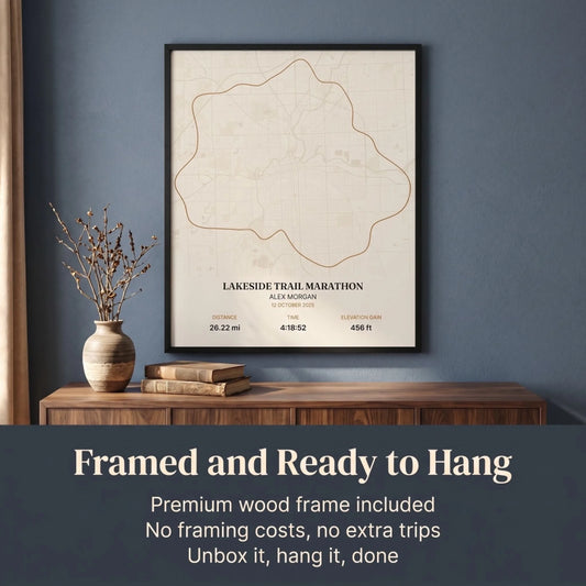
For a piece made just for the player, like a custom court rendering or a personalized design marking a club championship or a first match with a kid, the idea is simple: a custom piece is built around the details that make the moment specific, a date, a court, a name, rather than being a generic poster. That intention is what separates a real keepsake from something off the shelf.
Where to actually hang it: home, office, or gym

The piece matters, but placement is what makes it look intentional, and it is the step that turns a single print into real tennis room decor. The single most useful rule comes from the way galleries and museums hang work, and Apartment Therapy spells it out plainly: hang the center of the piece 57 inches from the floor, because that is roughly average eye level. Most people instinctively hang art too high. Drop it to 57" on center and even a modest print suddenly looks deliberate. For a group or a small gallery wall, treat the whole arrangement as one shape and center that shape at 57".
Where each style belongs, room by room:
- Home office. One confident piece behind the desk, at least 24x36" so it does not shrink on a video call. A patent print or a single court abstract reads as professional and personal at once. Spend 20 minutes on calls and people are reading your background as much as your face.
- Home gym. Energy over subtlety here. A bold vintage poster or a high-contrast clay-court piece at 24x36" or larger gives you something to look at between sets. Hang it on the wall you face, not behind you.
- Living room or den. A row of 2 or 3 framed posters above a console, or one statement piece at 28x40" over a sofa. Aim for art roughly two-thirds the width of the furniture beneath it so the wall feels balanced.
- Hallway or stairwell. A vertical run of smaller 12x16" prints, spaced 2 to 3 inches apart, turns a dead corridor into a small tennis gallery.
If you want to see how a tennis piece sits next to other athletic art before you decide, our wider range of sports wall art puts vintage, abstract, and line styles side by side, so you can compare a clay-court abstract against a racket patent print and pick the one that fits both the player and the room.
What separates a piece you hang from one you re-gift
A print that ends up on the wall has to clear a few practical bars. The cheap poster that arrives curled in a tube, or a frame that feels hollow the second you lift it, undoes all your good taste. A few things make the difference:
- Real paper. Fade-resistant, archival-quality inks hold color and do not yellow. It is the difference between art and a printout.
- A solid frame. Solid pine, not hollow MDF, in White, Natural Wood, Dark Wood, or Black so it matches the room. A shatterproof plexiglass front survives a knock off the wall.
- Ready to hang on arrival. The best version shows up ready to hang the day it lands, with hardware in place, so you are not hunting for a frame on a Sunday.
- The right size. A size range up to 28x40" covers everything from a desk shelf to a statement wall. For behind-the-desk or gym impact, aim for 24x36" or larger.
There is also a real safety net: free shipping available and a 30-Day Money-Back Guarantee mean a wrong frame color or size is easy to sort out, and every order includes a Certificate of Authenticity. Tennis has held people for a century and a half, from a Victorian garden game with 200 spectators at the first championship in 1877 to packed stadiums today. Art that honors that belongs on a wall, not in a closet.
Frequently asked questions
What kind of tennis art looks good without being tacky?
Stick to three styles that read as taste rather than merch: vintage poster art in flat colors, abstract court or clay texture, and clean racket line work or patent prints. Skip cartoon graphics and anything with a slogan. A framed print in a wood or black frame, hung at eye level, looks intentional in a way a novelty item never does.
Where should I hang tennis wall art at home?
Hang the center of the piece 57 inches from the floor, which is roughly eye level and the standard galleries use. Behind a desk or in a home gym, go large, 24x36 inches or bigger, on the wall you face. In a living room, aim for art about two-thirds the width of the furniture beneath it, and group a small series above a console.
Is vintage tennis wall art a good fit for a modern room?
Yes, if you watch the palette. Vintage-style posters in muted olive, cream, and clay-orange sit comfortably in a modern room because those are tones designers already use. Keep the frame simple, white for a bright space or dark wood for a moodier one, and one strong piece will anchor the wall without looking dated.
What size tennis print works in a home office or gym?
For a focal piece behind a desk or on a gym wall, aim for at least 24x36 inches so it reads well on camera and does not look lost. For a shelf, a side wall, or a grouping of two or three prints, smaller sizes from 12x16 to 16x20 inches work well. Sparkycare offers sizes from small accents up to 28x40 inches.
Will a framed tennis print arrive ready to hang?
It should. A quality framed print ships ready to hang the day it arrives, with a solid pine frame, a shatterproof plexiglass front, and hanging hardware already in place. That makes it far easier than a rolled poster that has to be flattened and framed before it can go up.