How to Decorate a Sports Room Without It Looking Like a Sports Bar
Francisco Barbero
There is a thin line between a sports room and a sports bar, and almost nobody crosses it on purpose. It happens 1 poster at a time: a glossy print taped here, a pennant there, a foam finger on the shelf, until the walls look like a wing place at 7 on a Friday night. The good news is that the fix has nothing to do with loving sports less. The best sports room decorating ideas for adults keep every bit of the passion and change only how it is presented. Curate instead of cover. Frame instead of tape. 3 considered pieces will always outclass 14 loose ones, and the whole shift usually takes an afternoon and zero new hobbies.
A sports themed room for adults is not a downgrade from fandom. It is fandom with editing. Below is how to land on the classy side of that line, room by room and wall by wall.
What Actually Separates a Sports Room From a Sports Bar
It is not the subject. It is the density and the finish. A sports bar wants volume: every surface covered, a dozen screens, signage competing for your eye, nothing framed because nothing is meant to last. A sports room is the opposite instinct. It treats the things you love like art, gives them room to breathe, and lets a few strong pieces carry the wall. The sport stays. The clutter goes.
Think of it as the difference between owning something and choosing it. A bar accumulates. A room curates. When you walk into a space and see 1 beautifully framed piece over a sofa instead of 9 taped-up posters at slightly different heights, you read intention immediately, and intention is what reads as classy sports decor. The 90 percent of stuff you leave off the wall is doing as much work as the 10 percent you put up. A useful target: cap a single wall at 3 to 5 pieces, and let the other 95 percent of your collection live in a drawer, a box, or storage.
The Sports Room Decorating Ideas That Start With Curation

Restraint is the whole game. Before you hang anything, sort your sports pieces into two piles: the few that genuinely move you, and everything else. The everything-else pile is where the sports-bar look lives. Be ruthless. A wall with three pieces you love beats a wall with 12 you merely have.
Once you have your shortlist, give each piece space. Negative wall around a frame is not wasted; it is what tells the eye the piece matters. One large 24x36 print can anchor an entire wall on its own with nothing else competing. A tidy trio of 18x24 frames, or a pair of 16x20s, can hold a sofa wall with calm authority. The rule of thumb most designers lean on is the 2/3 ratio: your art or arrangement should fill roughly two-thirds the width of the furniture beneath it, so an 84-inch sofa wants about 56 inches of art above it, centered. That single proportion stops a wall from looking either bare or crammed.
If you want a starting point for the actual imagery, a focused collection of Sports & Fitness Wall Art makes it easier to choose two or three pieces that already speak to each other instead of stitching together a wall from random one-offs.
Vintage or Modern: Pick a Lane (or Bridge Them on Purpose)
Generic sports art splits into two broad moods, and naming your lane keeps a room coherent. The vintage lane is muted and graphic: faded ochres and slate blues, old-poster typography energy, a worn-paper feel, stylized illustrations of classic equipment or anonymous athletes mid-motion. It pairs beautifully with leather, brass, and dark wood, and it carries a quiet, members-club gravity. The modern lane is cleaner and bolder: high-contrast abstracts, minimalist line studies of a body in motion, a tight palette of two or three colors, lots of white space. It suits concrete, matte black, and pale walls.
You do not have to choose only one, but you should choose on purpose. Mixing eras works when it looks deliberate rather than accidental. Designers do this constantly: as Apartment Therapy puts it, the trick is to clash old and new for a layered look, because contrast is what gives a space depth and personality instead of looking like the set of a period piece. The same designers recommend you avoid everything matching and mix wood tones, leaning into deeper, richer finishes for contrast. So one vintage-feel sports print framed in dark walnut, hung near a clean modern abstract in a thin black frame, can read as collected and intentional. Twelve random posters never will.
| If you lean | Sports art that fits | Frame and palette |
|---|---|---|
| Vintage / classic den | Muted illustrated equipment, faded action scenes, old-poster style graphics | Dark wood or black frames, warm ochre and slate tones, leather and brass |
| Modern / minimalist | High-contrast abstracts, single-line motion studies, 2 to 3 color pieces | Thin black or white frames, lots of negative space, matte and concrete |
| Considered mix | One strong vintage anchor plus one clean modern piece | Mixed wood tones on purpose, one shared accent color to tie them |
Frame It Like Art, Not Like a Locker

The fastest tell of a juvenile sports room is unframed paper. A poster tacked to drywall curls at the corners within a season and dents at the pin, and that physical sloppiness is most of what your eye registers as cheap. A proper frame fixes it in one move. Put the piece behind a clean frame with a front pane and it instantly reads gallery instead of gift shop, even if the subject is identical.
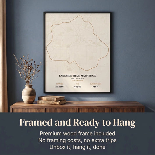
A few rules keep framed sports art looking grown-up. Match your frame colors across the room; black or dark wood reads the most adult, and switching frame finishes randomly is the visual equivalent of mismatched socks. Give bigger prints a mat. A 1.5-inch to 2-inch mat border around a 16x20 print adds breathing room and lifts it a full tier. And size up rather than down: people consistently hang art too small for the wall, and an undersized 8x10 frame in a 14-foot room looks marooned. The weight of the print matters too. A piece on quality paper stock behind a solid front pane hangs flat and stays flat, while thin poster paper curls within a season. When you are buying for a den or bonus room, framed pieces in Man Cave Wall Art that arrive ready to hang save you the trip to a frame shop and the wait that comes with it.
Hang It at the Right Height (the Part Most People Get Wrong)
Spacing and height are what separate curated from cluttered, and there are real numbers behind both. Per interior design experts at Homes & Gardens, the center of a piece, or the visual center of a grouping, should sit around 57 to 60 inches from the floor, which is average eye level and the same standard galleries use. Over a sofa, console, or desk, keep the bottom edge 4 to 8 inches above the furniture so the art and the piece below read as one connected display rather than a frame floating near the ceiling. In a gallery grouping, hold a consistent 2 to 3 inches between frames.
That tight, even gap is what makes a multi-piece arrangement look like 1 intentional unit instead of scattered clutter. 2 layouts do almost all the work in a sports room. A clean row of 3 or 4 matching frames in a single horizontal line above a sofa is calm and nearly foolproof. A tight 2-by-2 grid behind a desk or on a feature wall, spaced an even 3 inches, reads orderly and a little architectural. Lay the whole thing out on the floor first and adjust the spacing before a single nail goes in. 5 minutes on the floor saves 20 holes in the wall.
Where a Sports Room Actually Belongs in the House
Part of staying classy is putting the sports energy where it fits and not letting it bleed into the formal rooms. A few homes for it work best:
- The den or study. Dark walls, leather, and one or two vintage-feel framed pieces turn a sports allegiance into something closer to a gentleman's library. This is the most grown-up home for it.
- The man cave or basement. The dedicated space, where you can lean harder into the theme without it taking over the house. Even here, restraint and framing are what keep it from sliding into bar territory.
- The bonus room or home office. A tidy grid of framed prints behind a desk gives you the energy without the noise, and reads as a personality cue rather than a shrine.
The thread through all three is the same: contain it, frame it, and let a few strong pieces speak. A grown-up sports room is not a watered-down version of fandom. It is fandom with the volume set right and the framing done properly. When you are ready to choose the pieces, start with a curated Sports & Fitness Wall Art collection. The framed prints arrive ready to hang the day they land (solid pine frame in White, Natural Wood, Dark Wood, or Black, with a shatterproof front), come in sizes from small accents up to 28x40, and come with free shipping available and a 30-Day Money-Back Guarantee. Pick the 2 or 3 pieces that genuinely move you, and let the empty wall around them do the rest of the talking.
Sports Room Decorating FAQ
How do I make a sports room look classy and not like a sports bar?
Curate hard and frame everything. Cut your sports pieces down to the two or three you truly love, put each in a clean frame with a front pane, and leave plenty of empty wall around them. Density and unframed posters are what create the sports-bar look, so restraint and proper framing fix it.
What kind of sports art works in a grown-up room?
Stylized, generic sports art reads the most adult: muted vintage-feel illustrations of classic equipment or anonymous athletes in motion, or clean modern abstracts and single-line studies. Lean toward painterly, graphic imagery over glossy current-season posters, and keep your frame colors consistent across the room.
Should I use vintage or modern sports decor?
Either works as long as you commit to the mood. Vintage suits leather, brass, and dark wood with muted ochre and slate tones. Modern suits matte black, concrete, and pale walls with high-contrast pieces and white space. You can bridge the two, but only if the mix looks deliberate, such as one vintage anchor plus one clean modern piece sharing an accent color.
How high should I hang sports art?
Hang the center of a piece, or the visual center of a group, about 57 to 60 inches from the floor, which is standard gallery eye level. Above a sofa or desk, keep the bottom edge 4 to 8 inches above the furniture, and hold a consistent 2 to 3 inches between frames in a gallery grouping.
How many pieces of sports art should I hang?
Fewer than you think. A single large 24x36 print can anchor a whole wall, or use a clean row of 3 to 4 matching frames, or a tight 2-by-2 grid. Aim for your art to span about two-thirds the width of the furniture below it, and let restraint do the work that clutter cannot.