Nursery Wall Art and Your Baby's Visual Development: What Actually Helps
Francisco Barbero
Here is the honest version. Nursery wall art will not make your baby smarter, and any product that promises that is overselling. What is true, and backed by pediatric guidance, is that newborns see high-contrast patterns best, and that simple visual stimulation is a normal part of how their eyes develop. So the right nursery wall art for development is less about price tags and more about what your baby can actually see from the crib.
This guide walks through what babies see at each stage, why black and white works early on, and how to choose art that earns its spot on the wall. No big claims. Just what the research supports and what looks good in a real room.
What can newborns actually see?
Less than you might think, and that changes everything about what to hang. Vision is the least developed sense at birth. In the early weeks, babies can make out light, large shapes, faces, and movement, but their distance vision is blurry. According to the American Academy of Pediatrics, a newborn sees best at about 8 to 12 inches away, roughly the gap between a baby's eyes and yours during feeding. The American Academy of Ophthalmology adds that at birth, infants are very sensitive to bright light, and that large shapes and bold colors are what start to catch their attention as the retina develops.
So a delicate, pale print full of fine detail mostly disappears to a 2-week-old. Bold shapes and strong edges register. That is the single most useful fact for choosing early nursery art: think big, simple, and high contrast, placed close to where the baby spends time.
Why is high contrast art for babies recommended?

Because contrast is what a young baby's eyes can lock onto. Black against white is the sharpest contrast there is, so those patterns are easier to distinguish than soft pastels in the first months. Michigan State University Extension notes that babies have an easier time focusing on high-contrast objects during this stage, and that bold black-and-white images can help encourage visual development. The AAP also points out that by about 4 months, many babies show extra interest in circular patterns like bull's-eyes and spirals, which is part of why faces, full of curves, are so compelling to them.
A fair note on what this means. High-contrast art can support normal visual development by giving a baby something their eyes can engage with. It is not a treatment, and it does not raise IQ. Think of it the way pediatric sources frame it: a helpful part of a stimulating environment, not a guarantee. A few bold black-and-white pieces, or one strong graphic print, do the job.
How does a baby's vision change month by month?
Quickly, and in a way that should shape what you hang and when. Knowing the rough timeline helps you pick art that stays interesting instead of swapping it every few weeks. These stages come from pediatric and ophthalmology guidance, and every baby is a little different.
Birth to about 2 months. Light, large shapes, movement, and faces. Distance vision is blurry, and the eyes may wander. This is peak high-contrast season.
Around 2 to 3 months. Babies begin to follow a moving object and focus more steadily, per the American Academy of Ophthalmology. Color starts coming online.
Around 4 months. Better color vision and more interest in shades and patterns, including those circular shapes.
Around 5 to 6 months. Depth perception develops, color vision keeps maturing, and babies can tell objects apart and reach for them. By now, softer and more colorful art lands the way it could not at 3 weeks.
What are the best nursery wall art styles for each stage?
Match the art to what the baby can see, then let it grow with the room. A simple approach: start bold and simple, then add color and detail as their vision catches up.
For the early months, lean into high contrast. Bold black-and-white shapes, thick stripes, simple animal silhouettes, or a graphic pattern read clearly to a young baby and look genuinely modern on the wall. Place one or two pieces low and close to where the baby lies.
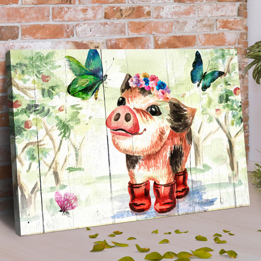
From a few months on, you can introduce gentle color and friendlier subjects. This is where soft animal prints shine. Safari and woodland themes are popular for good reason: they are gender neutral, they pair with warm wood and green accents, and kids stay fond of them for years. Our safari animal art collection leans into that softer, watercolor-style look that suits a settled nursery.

For the long haul, choose pieces that will not feel babyish by toddlerhood. Interior designers increasingly favor nurseries that grow with the child rather than getting a full redo a year later. As one Apartment Therapy piece on nursery design points out, babies spend a lot of time looking up, so the surfaces in their sightline are worth a little thought. A well-chosen print outlasts a theme.
Where should you hang nursery art so it is safe and visible?
Close enough to see, but never directly over the crib. Two goals are in tension here, visibility and safety, and safety wins. A young baby focuses best on things roughly 8 to 12 inches away, so art on the wall beside the crib or above the changing table is far more useful than a single piece across the room. Place it low, near the baby's eye line, not at adult height.
The firm rule: do not hang anything heavy directly above where your baby sleeps. Frames, shelves, and decor can fall, so keep the space above the crib clear and mount art on adjacent walls instead. A safety note in the product's favor here is the front material. Sparkycare framed prints use a shatterproof plexiglass front rather than glass, which is a sensible plus anywhere near a crib, and solid pine frames rather than hollow MDF, so they hold their hardware on the wall. Keep any frame well away from little hands and out of the crib zone.
What size and format work best in a nursery?
Big enough to be seen, sized to the wall, in a finish that suits a baby's room. For a young baby, scale and contrast matter more than fine detail, so do not go too small on the pieces meant to be looked at. A single 16x20 inch print or a set of three smaller pieces along one wall both work well. For the gap above a dresser or glider, aim for art that spans roughly two-thirds of the furniture width so the wall looks intentional. The full breakdown lives in our wall art size guide.
On format, a few things suit nurseries specifically. Framed prints under shatterproof plexiglass look crisp and stay safe near a crib, and the matte finish keeps glare down on a sunny wall. Sparkycare prints come in sizes from 5x7" to 28x40" plus ISO A3/A2/A1 and four frame colors (White, Natural Wood, Dark Wood, and Black), with a Certificate of Authenticity and a 30-Day Money-Back Guarantee. That range makes it easy to match the size to the wall instead of settling.
Frequently asked questions
Does high contrast art actually help babies?
It can support normal visual development by giving a young baby patterns their eyes can clearly focus on. Pediatric and university sources note that black-and-white, high-contrast images are easier for newborns to distinguish and can encourage early visual engagement. What it does not do is boost intelligence or guarantee outcomes. Treat it as one helpful part of a stimulating nursery, not a developmental shortcut.
What can babies see at birth?
Mostly light, large shapes, movement, and faces, all of it blurry at a distance. The American Academy of Pediatrics says newborns focus best at about 8 to 12 inches, roughly the distance to a caregiver's face during feeding. Bold, simple, high-contrast images register far better than fine detail or pale colors in the first weeks.
When do babies start to see color?
Color vision comes online gradually over the first months. Babies begin noticing bolder colors in the early months, with color vision developing more fully around 4 to 6 months, according to pediatric guidance. That is why soft, colorful nursery art makes more sense a few months in, while high-contrast pieces suit the newborn stage.
Is it safe to hang art above the crib?
Keep the space directly above the crib clear. Frames, shelves, and heavy decor can fall, so the safe habit is to avoid hanging anything heavy over where a baby sleeps. Mount art on adjacent walls at the baby's eye level instead. Choosing frames with a shatterproof plexiglass front rather than glass is a sensible extra precaution near a crib.
Choosing nursery art, the practical way
Start with what your baby can see now, bold and high-contrast, then add color and detail as their vision matures over the first months. Hang it close to their eye line and clear of the crib. When you are ready to choose, browse our nursery wall art collection, where pieces come in a range of sizes and 4 frame colors, with solid pine frames, shatterproof plexiglass, a Certificate of Authenticity, and a 30-Day Money-Back Guarantee, so you can pick what fits the wall and the stage your baby is in.