Hoe creëer je een bibliotheeksfeer in huis (zelfs zonder kamerhoge planken)
Francisco Barbero
Je hebt geen speciale kamer of kamerhoge kasten nodig voor het gevoel van een thuisbibliotheek. De meeste goede ideeën voor een thuisbibliotheek komen neer op één zet: creëer een enkel leeshoekje in plaats van een hele bibliotheek, en laat vervolgens wanddecoratie, warme kleuren en één goede stoel het werk doen. Een muur van ongeveer 1,80 bij 1,80 meter is voldoende. Of je nu huurt of werkt met één lege muur, je kunt nog steeds die rustige, intellectuele sfeer creëren die ervoor zorgt dat mensen vertragen zodra ze binnenkomen.
Deze gids laat zien hoe je een bibliotheek nabootst met kunst als je geen ruimte hebt voor planken, hoe je een leeshoekje stijlvol inricht, welke stijlen prints er intellectueel uitzien zonder te geforceerd te zijn, en de 3 cijfers die voorkomen dat het geheel eruitziet als een bijzaak.
Hoe creëer je het gevoel van een thuisbibliotheek zonder inbouwkasten?
Stop met denken in "bibliotheek" en begin te denken in een "leeshoekje". Een wand met ingebouwde planken is een verbouwing. Een leeshoekje is een weekendwerkje. De kortere weg is om ingelijste kunst de plek van planken in te laten nemen: een muur met zorgvuldig gekozen prints oogt verzameld en literair op dezelfde manier als een volle boekenkast, alleen kost het je 3 spijkers in plaats van een aannemer. Apartment Therapy trekt dezelfde conclusie over leesplekken en merkt op dat een goede hoek neerkomt op verlichting, een plek voor je boeken en comfort, en dat je zo'n hoekje kunt creëren in een vergeten plekje dat je al hebt.
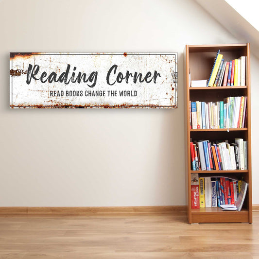
Kies eerst de muur. Een hoek bij een raam is ideaal, omdat je daar daglicht hebt om te lezen en een natuurlijke achtergrond. Als je zelfs maar één kleine boekenkast hebt, een vrijstaand meubel van 75 tot 105 cm hoog, zet deze dan tegen die muur en hang kunst erboven en ernaast. De kunst geeft de hoogte die de kast mist, waardoor een lage boekenkast plotseling aanvoelt als onderdeel van een volledige bibliotheekwand. Geen boekenkast? Een paar slanke wandplanken, elk ongeveer 60 cm breed, bieden plek aan een rij boeken en een paar leunende lijsten; dat is voor een huurwoning al meer dan genoeg "bibliotheek".
De andere helft van het geheim is sfeer, en sfeer draait voornamelijk om kleur en licht. Bibliotheekachtige kamers voelen warm en een beetje gedempt aan, niet helder en open. Je kunt dat gevoel bereiken met kunst en een lamp, lang voordat je besluit om de boel te gaan schilderen.
Welke wanddecoratie geeft een kamer die bibliotheek-esthetiek?

Vier soorten kunst zorgen voor de bibliotheek-esthetiek. Vintage literaire prints en prints van boekenruggen zijn de voor de hand liggende keuze: rijen versleten ruggen of een stapel boeken ogen als een stilleven en verwijzen naar lezen zonder dat het te letterlijk wordt. Antieke kaarten voegen direct de grandeur van de oude wereld toe, vol sepia en fijn lijnwerk, en ze zien eruit alsof ze uit een werkkamer uit de jaren 30 komen. Botanische illustraties, zoals ingedroogde varens en bloemen in de stijl van oude veldgidsen, voegen dat intellectuele, verzamelde gevoel toe zonder dat het zwaar wordt. En sfeervolle bibliotheek- of landschapsscènes, zoals een gewelfde leeszaal of een mistige heuvel afgebeeld als een klein schilderij, dragen bij aan de rustige, romantische kant van de look.
Dit werkt omdat alle vier de stijlen een vintage, licht verouderd palet delen, waardoor ze bij elkaar passen, zelfs als de onderwerpen verschillen. Ontwerpers gebruiken dezelfde logica bij het creëren van een 'dark academia'- of studeerkamerstijl, waarbij ze leunen op antieke boeken, ingelijste kaarten en vintage kunst in lijsten van warm natuurlijk of donker hout. Door twee of drie van deze printtypes op één muur te mixen, krijg je precies die ruimte die aanvoelt alsof hij in de loop der jaren is samengesteld in plaats van in één middag besteld.
Je kunt kiezen voor traditioneel of het wat lichter houden. Een combinatie van botanische prints en kaarten in lichte eiken lijsten voelt als een zonnige studeerkamer in een huisje. Dezelfde onderwerpen in donker hout tegen een diepgroene muur zorgen voor die knusse bibliotheeksfeer. Als je een startpunt wilt dat deze stijlen al groepeert, is de collectie Library & Reading Room Wall Art speciaal opgebouwd rond dit vintage, intellectuele gevoel.
Hoe arrangeer je een literaire galerijmuur boven een leesstoel?
Een galerijmuur is de snelste manier om een volledige boekenkast na te bootsen, en het volgt een simpele formule met drie ankers. Begin met één groter stuk, ongeveer 45 bij 60 cm, als visueel anker. Voeg twee middelgrote prints toe, ongeveer 30 bij 40 cm, voor de balans. Vul daarna aan met 2 tot 4 kleine lijsten van 13 bij 18 of 20 bij 25 cm om de randen te verzachten en die gelaagde, verzamelde look te creëren. In totaal vijf tot zeven lijsten is de ideale hoeveelheid voor een hoekje. Leg het hele arrangement eerst op de vloer en schuif ermee tot de afstand goed voelt voordat je ook maar één spijker in de muur slaat.
Afstand en hoogte zijn waar de meeste mensen de fout in gaan. Houd een consistente tussenruimte van 5 tot 8 cm aan tussen elke lijst, zodat de groep als één geheel wordt gezien in plaats van als losse kunstwerken. Behandel wat betreft de hoogte de hele groep als één enkel kunstwerk en centreer dit op 145 cm vanaf de vloer. Dat getal van 145 cm is de standaard in musea en galerieën omdat het precies op gemiddelde ooghoogte uitkomt; Apartment Therapy bevestigt dat dit ook geldt voor een hele galerijmuur die als één groot schilderij wordt behandeld, niet alleen voor een enkele lijst. Hang je boven de stoel? Laat 15 tot 20 cm ruimte tussen de bovenkant van de rugleuning van de stoel en de onderste rij lijsten, zodat de kunst en de stoel verbonden voelen.
Nog een regel voor een opvallend stuk boven een stoel: de tweederde-richtlijn. De kunst, of de hele groep, moet ongeveer tweederde van de breedte van het meubel eronder beslaan. Voor een standaard leesstoel van 75 cm betekent dit ongeveer 50 cm aan kunstbreedte. Als je veel smaller gaat, lijkt het kunstwerk te zweven en eenzaam te staan. Dit is het verschil tussen een muur die er ontworpen uitziet en een muur waarbij je hebt opgehangen wat je toevallig had.
Hoe decoreer je een leeshoek zodat deze af voelt?

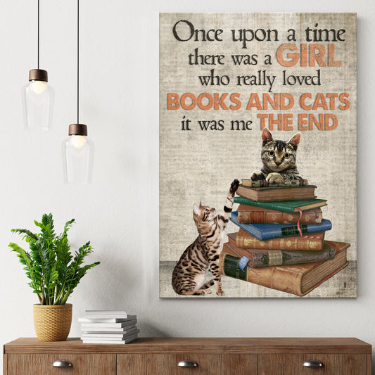
Een leeshoek heeft meestal al een stoel, een plaid en een lamp. Wat het af maakt, is dat ene kunstwerk dat de hoek verankert. Hang een enkele ingelijste print aan de muur waar je naar kijkt als je zit, op zittende ooghoogte in plaats van op de staande 145 cm. Hierdoor verandert de losse verzameling comfortabele spullen in een ontworpen ruimte. Wandkunst voor een leeshoek werkt het beste als het persoonlijk is: een zachte print van een boekenstapel, een rustig bibliotheektafereel of een literaire regel die iets voor je betekent. Dit is ook de plek in de kamer waar een sentimenteel stuk zijn plek verdient.
Licht is wat mensen vaak verkeerd aanpakken. Een leeshoek vraagt om zacht, gelaagd, gedimd licht, niet één felle plafondlamp. Gebruik een klein lampje met een warme lichtbron van ongeveer 2700K; dit voorkomt schittering op zowel de lijst als de pagina en geeft de hele hoek een avondgevoel, zelfs op klaarlichte dag. Kleur doet de rest. Wandkunst in een leeshoek oogt knusser tegen een warme of verzadigde achtergrond. Experts van Homes & Gardens wijzen erop dat bijna elke kleur gezellig kan aanvoelen met de juiste tint; ze raden kruidige tinten aan zoals kaneel, oker, terracotta en warme saliegroen voor een hoekje dat gemaakt is om in weg te kruipen met een boek en een kop thee.
Als schilderen niet mogelijk is omdat je huurt, creëer de warmte dan met textiel en lijsten. Een roestbruin of bosgroen plaid, een vloerkleed van jute of wol onder de stoel, en donkerhouten of zwarte lijsten om de kunst trekken de hele hoek naar dat geborgen bibliotheekgevoel zonder de muren aan te raken.
Hoe zit het met de prints zelf en de lijsten?
De bibliotheek-look valt of staat bij de kwaliteit van de prints, want een dunne, fletse print verpest het vintage-effect. Kunst die gedrukt is met lichtbestendige, archiefwaardige inkt behoudt de diepe, verzadigde tinten die vintage- en botanische onderwerpen nodig hebben. Een matte afwerking oogt meer als een oude prent dan als een glanzende poster, wat precies die verouderde sfeer geeft die je wilt. Bij ingelijste stukken betekent een solide grenenhouten lijst met een onbreekbare plexiglas voorkant dat het werk klaar is om opgehangen te worden zodra het aankomt; geen extra trip naar de lijstenmaker nodig.
De kleur van de lijst bepaalt de toon. Voor een traditionele, serieuze bibliotheek doen donkerhouten of zwarte lijsten tegen een diepgekleurde muur het werk. Voor een lichtere, landelijke studeerkamer houden lijsten in natuurlijk hout of wit de botanische prints en kaarten luchtig. Het mixen van twee soorten lijsten in een galerijmuur, bijvoorbeeld hout en zwart, versterkt juist de look van een in de loop der tijd verzamelde collectie; je hoeft dus niet elke lijst bij elkaar te laten matchen. Verkrijgbaar in formaten van een kleine accentlijst tot een statementstuk van 70 bij 100 cm, je kunt de hele muur in één keer samenstellen. De collectie Bookish & Literary Wall Art is de gemakkelijkste plek om een bijpassende set literaire, botanische en kaartprints voor de hoek te vinden, en alles wordt verzonden met gratis verzendopties en een 30-dagen geld-terug-garantie als een stuk toch niet helemaal op de muur past.
Veelgestelde vragen
Hoe laat ik mijn kamer op een bibliotheek lijken zonder ingebouwde boekenplanken?
Creëer één boekenhoekje in plaats van een hele bibliotheek. Combineer een muur met 5 tot 7 ingelijste vintage prints met een kleine vrijstaande boekenkast of een paar wandplanken, en voeg dan een stoel, een warme lamp en diepe kleuren via textiel toe. De ingelijste kunst vervangt de kamerhoge planken en oogt op zichzelf al verzameld en literair.
Welk soort wanddecoratie oogt literair of intellectueel?
Vier printstijlen ogen als een bibliotheek: vintage literaire prints of boekenruggen, antieke kaarten, botanische illustraties en sfeervolle bibliotheek- of landschapsscènes. Ze delen een verouderd, warm palet, dus het mixen van twee of drie stijlen op één muur ziet eruit alsof het jarenlang is verzameld. Slanke donkerhouten of zwarte lijsten versterken het intellectuele gevoel verder.
Hoe hoog moet ik kunst boven een leesstoel ophangen?
Centreer een enkel stuk of een hele galerijgroep op 145 cm vanaf de vloer, de standaard gemiddelde ooghoogte in galerieën en musea. Laat bij het ophangen direct boven een stoel 15 tot 20 cm ruimte tussen de bovenkant van de rugleuning en de onderkant van de kunst, zodat de twee verbonden aanvoelen in plaats van los van elkaar te zweven.
Welke kleuren maken een leeshoek knus?
Warme, verzadigde tinten werken het beste: terracotta, oker, kaneel, diepgroen en warme saliegroen maken een hoekje geborgen en sfeervol. Als je niet kunt schilderen, breng die tinten dan in via een plaid, een kleed en de kleur van de lijsten, en gebruik een warme 2700K-lichtbron om de hele hoek een avondgevoel te geven.
Hoe groot moet de kunst zijn voor een klein bibliotheekhoekje?
Streef voor een statementstuk boven een stoel naar kunst die ongeveer tweederde van de breedte van het meubel beslaat, dus ongeveer 50 cm aan kunst boven een stoel van 75 cm. Mix voor een galerijmuur één groter anker van 45 bij 60 cm, een paar middelgrote van 30 bij 40 cm en een paar kleine lijsten van 13 bij 18 of 20 bij 25 cm, met een tussenruimte van 5 tot 8 cm.